 我的书签
我的书签
 添加书签
添加书签 移除书签
移除书签- Modal对话框
- 规则
- 代码演示
- API
- Modal
- ModalSerivce.alert(title, message, actions?, platform?)
- ModalSerivce.prompt(title, message, callbackOrActions, type?, defaultValue?, placeholders?, platform?)
- ModalSerivce.operation(actions?, platform?)
Modal对话框
用作显示系统的重要信息,并请求用户进行操作反馈,eg:删除某个重要内容时,弹出 Modal 进行二次确认。
规则
- 尽可能少用。Modal 会打断用户操作,只用在重要的时候。
- 标题应该简明,不能超过 1 行;描述内容应该简明、完整,一般不多于 2 行。
- 操作按钮最多到 3 个(竖排),一般为 1-2 个(横排);3 个以上建议使用组件 ActionSheet 来完成。
- 一般将用户最可能点击的按钮,放在右侧。另外,取消按钮应当始终放在左侧。
代码演示
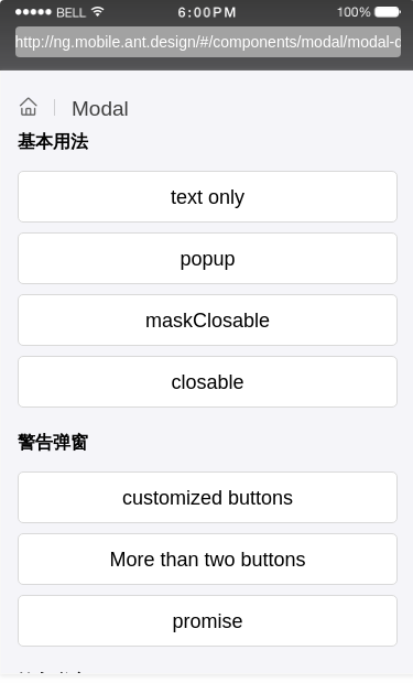
基本用法
最简单的用法。
import { Component } from '@angular/core';import { ModalService } from 'ng-zorro-antd-mobile';@Component({selector: 'demo-modal-basic',template: `<WingBlank><WhiteSpace></WhiteSpace><div Button (onClick)="showModal('modal1')">text only</div><WhiteSpace></WhiteSpace><Modal [(ngModel)]="this.state.modal1" [transparent]="true" [title]="'Title'" [footer]="footer"><div [ngStyle]="{ height: 100, overflow: 'scroll' }">scoll content... <br />scoll content... <br />scoll content... <br />scoll content... <br />scoll content... <br />scoll content... <br /></div></Modal><div Button (onClick)="showModal('modal2')">popup</div><WhiteSpace></WhiteSpace><Modal [(ngModel)]="this.state.modal2" [popup]="true" [animationType]="'slide-up'" (onClose)="onClose('modal2')"><List [renderHeader]="renderHeader" [className]="'popup-list'"><ListItem>股票名称</ListItem><ListItem>股票代码</ListItem><ListItem>买入价格</ListItem><ListItem> <div Button [type]="'primary'" (onClick)="onClose('modal2')">买入</div> </ListItem></List></Modal><div Button (onClick)="showModal('modal3')">maskClosable</div><WhiteSpace></WhiteSpace><Modal [(ngModel)]="this.state.modal3" [transparent]="true" [title]="'Title'" [maskClosable]="true" (onClose)="onClose('modal3')"><div [ngStyle]="{ height: 100, overflow: 'scroll' }">scoll content... <br />scoll content... <br />scoll content... <br /></div></Modal><div Button (onClick)="showModal('modal4')">closable</div><WhiteSpace></WhiteSpace><Modal [(ngModel)]="this.state.modal4" [transparent]="true" [title]="'Title'" [closable]="true" (onClose)="onClose('modal4')"><div [ngStyle]="{ height: 100, overflow: 'scroll' }">scoll content... <br />scoll content... <br />scoll content... <br /></div></Modal></WingBlank>`,styles: [`.popup-list .am-list-body {height: 210px;overflow: auto;}`]})export class DemoModalBasicComponent {state = {modal1: false,modal2: false,modal3: false,modal4: false};footer = [{text: 'Ok',onPress: () => {console.log('ok');this.onClose('modal1');}}];footer2 = [{text: 'Ok',onPress: () => {console.log('ok');this.onClose('modal2');}}];constructor(private _modal: ModalService) {}modelChange(event) {console.log('asdfasdf', event);}onClose(key) {this.state[key] = false;}showModal(key) {this.state[key] = true;}renderHeader() {return '委托买入';}}
警告弹窗
包含无按钮, 确认框, 多按钮情况。
import { Component } from '@angular/core';import { ModalService, ToastService } from 'ng-zorro-antd-mobile';@Component({selector: 'demo-modal-alert',template: `<WingBlank><WhiteSpace></WhiteSpace><div Button (onClick)="showAlert()">customized buttons</div><WhiteSpace></WhiteSpace><div Button (onClick)="showAlertMuchButtons(message)">More than two buttons</div><WhiteSpace></WhiteSpace><ng-template #message><div>More than two buttons</div></ng-template><div Button (onClick)="showPromise()">promise</div><WhiteSpace></WhiteSpace></WingBlank>`})export class DemoModalAlertComponent {constructor(private _modal: ModalService, private _toast: ToastService) {}showAlert() {ModalService.alert('Delete', 'Are you sure ?', [{ text: 'Cancel', onPress: () => console.log('cancel') },{ text: 'OK', onPress: () => console.log('ok') }]);}showAlertMuchButtons(message) {ModalService.alert('Much Buttons', message, [{ text: 'Button1', onPress: () => console.log('第0个按钮被点击了') },{ text: 'Button2', onPress: () => console.log('第1个按钮被点击了') },{ text: 'Button2', onPress: () => console.log('第2个按钮被点击了') }]);}showPromise() {ModalService.alert('Delete', 'Are you sure???', [{ text: 'Cancel', onPress: () => console.log('cancel') },{text: 'Ok',onPress: () =>new Promise(resolve => {ToastService.info('onPress Promise', 1000);setTimeout(resolve, 1000);}),style: {color: '#ffffff',background: '#00ff00'}}]);}}
输入弹窗
包含输入普通文字, 密码, 登录信息样式。
import { Component } from '@angular/core';import { ModalService, ToastService } from 'ng-zorro-antd-mobile';@Component({selector: 'demo-modal-prompt',template: `<WingBlank><WhiteSpace></WhiteSpace><div Button (onClick)="showPromptPromise()">promise</div><WhiteSpace></WhiteSpace><div Button (onClick)="showPromptDefault()">defaultValue</div><WhiteSpace></WhiteSpace><div Button (onClick)="showSecure()">secure-text</div><WhiteSpace></WhiteSpace><div Button (onClick)="showCustom()">custom buttons</div><WhiteSpace></WhiteSpace><div Button (onClick)="showLogin()">login-password</div><WhiteSpace></WhiteSpace></WingBlank>`})export class DemoModalPromptComponent {constructor(private _modal: ModalService, private _toast: ToastService) {}showPromptPromise() {ModalService.prompt('input name','please input your name',[{text: 'Close',onPress: value =>new Promise(resolve => {ToastService.info('onPress promise resolve', 1000);setTimeout(() => {resolve();console.log(`value:${value}`);}, 1000);})},{text: 'Hold on',onPress: value =>new Promise((resolve, reject) => {ToastService.info('onPress promise reject', 1000);setTimeout(() => {// reject();console.log(`value:${value}`);}, 1000);})}],'default',null,['input your name']);}showPromptDefault() {ModalService.prompt('defaultValue','defaultValue for prompt',[{ text: 'Cancel' }, { text: 'Submit', onPress: value => console.log(`输入的内容:${value}`) }],'default',['100']);}showSecure() {ModalService.prompt('Password', 'Password Message', password => console.log(`password: ${password}`), 'secure-text');}showCustom() {ModalService.prompt('Password','You can custom buttons',[{ text: '取消' }, { text: '提交', onPress: password => console.log(`密码为:${password}`) }],'secure-text');}showLogin() {ModalService.prompt('Login','Please input login information',(login, password) => console.log(`login: ${login}, password: ${password}`),'login-password',['default', '123456'],['Please input name', 'Please input password']);}}
操作弹窗
操作对话框。
import { Component } from '@angular/core';import { ModalService } from 'ng-zorro-antd-mobile';@Component({selector: 'demo-modal-operation',template: `<WingBlank><WhiteSpace></WhiteSpace><div Button (onClick)="showOpeartion()">operation</div><WhiteSpace></WhiteSpace></WingBlank>`})export class DemoModalOperationComponent {constructor(private _modal: ModalService) {}showOpeartion() {ModalService.operation([{ text: '标为未读', onPress: () => console.log('标为未读被点击了') },{ text: '置顶聊天', onPress: () => console.log('置顶聊天被点击了') }]);}}
API
Modal
| 属性 | 说明 | 类型 | 默认值 |
|---|---|---|---|
| visible | 对话框是否可见 | Boolean | false |
| closable | 是否显示关闭按钮 | Boolean | false |
| maskClosable | 点击蒙层是否允许关闭 | Boolean | true |
| onClose | 点击 x 或 mask 回调 | (): void | 无 |
| transparent | 是否背景透明 | Boolean | false |
| popup | 是否弹窗模式 | Boolean | false |
| animationType | 可选: 'slide-down/up' / 'fade' / 'slide' | String | fade |
| title | 标题 | TemplateRef | 无 |
| footer | 底部内容 | Array [{text, onPress}] | [] |
platform (Web Only) | 设定组件的平台特有样式, 可选值为 android, ios, 默认为 ios | String | ios' |
ModalSerivce.alert(title, message, actions?, platform?)
| 属性 | 说明 | 类型 | 默认值 |
|---|---|---|---|
| title | 标题 | String 或 TemplateRef | 无 |
| message | 提示信息 | String 或 TemplateRef | 无 |
| actions | 按钮组, [{text, onPress, style}] | Array | 无 |
| platform | 设定组件的平台特有样式, 可选值为 android, ios, 默认为 ios | String | 'ios' |
ModalSerivce.alert(title, message, actions?, platform?).close() 可以在外部关闭 Alert
ModalSerivce.prompt(title, message, callbackOrActions, type?, defaultValue?, placeholders?, platform?)
| 属性 | 说明 | 类型 | 默认值 |
|---|---|---|---|
| title | 标题 | String 或 TemplateRef | 无 |
| message | 提示信息 | String 或 TemplateRef | 无 |
| callbackOrActions | 按钮组 [{text, onPress}] 或回调函数 | Array or Function | 无 |
| type | prompt 的样式 | String (default, secure-text, login-password) | default |
| defaultValue | ['', ''] | String[] | - |
| placeholders | ['', ''] | String[] | - |
| platform | 设定组件的平台特有样式, 可选值为 android, ios, 默认为 ios | String | 'ios' |
ModalSerivce.prompt(title, message, callbackOrActions, type?, defaultValue?, placeholders?, platform?).close() 可以在外部关闭 prompt`
ModalSerivce.operation(actions?, platform?)
| 属性 | 说明 | 类型 | 默认值 |
|---|---|---|---|
| actions | 按钮组, [{text, onPress, style}] | Array | 无 |
| platform | 设定组件的平台特有样式, 可选值为 android, ios, 默认为 ios | String | 'ios' |
ModalSerivce.operation(actions?, platform?).close() 可以在外部关闭 operation`
