 我的书签
我的书签
 添加书签
添加书签 移除书签
移除书签- Pagination分页器
- 规则
- 代码演示
- API
Pagination分页器
分隔长列表,每次只加载一个页面。
规则
- 当加载/渲染所有数据将花费很多时间或者流量时使用
代码演示
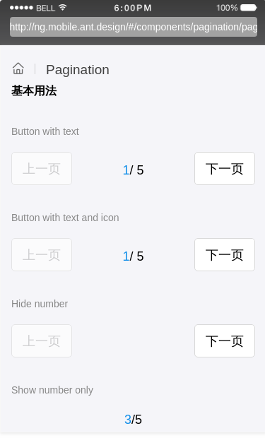
基本用法
基本的分页器。
import { Component } from '@angular/core';@Component({selector: 'demo-pagination-basic',template: `<div class="pagination-container"><p class="sub-title">Button with text</p><Pagination [total]="5" [current]="1" [locale]="locale"></Pagination><p class="sub-title">Button with text and icon</p><Pagination class="custom-pagination-with-icon"[total]="5"[current]="1"[locale]="{prevText:localeLeft,nextText:localeRight}"></Pagination><p class="sub-title">Hide number</p><Pagination [simple]="true" [total]="5" [current]="1" [locale]="locale"></Pagination><p class="sub-title">Show number only</p><Pagination [mode]="'number'" [total]="5" [current]="3"></Pagination><p class="sub-title">Point style</p><Pagination [mode]="'pointer'" [total]="5" [current]="2" style="marginBottom: '16px'"></Pagination><ng-template #localeLeft><span class="arrow-align"><Icon type="left"></Icon>上一步</span></ng-template><ng-template #localeRight><span class="arrow-align">下一步<Icon type="right"></Icon></span></ng-template></div>`,styles: [`.pagination-container {margin: 0 15px;}.custom-pagination-with-icon .am-pagination-wrap-btn-prev .am-button-inline {padding-left: 0;padding-right: 10px;}.custom-pagination-with-icon .am-pagination-wrap-btn-next .am-button-inline {padding-left: 10px;padding-right: 0;}.arrow-align {display: flex;align-items: center;}.sub-title {color: #888;font-size: 14px;padding: 30px 0 18px 0;}`]})export class DemoPaginationBasicComponent {locale = {prevText: 'Prev',nextText: 'Next'};constructor() {}}
API
| 属性 | 说明 | 类型 | 默认值 |
|---|---|---|---|
| mode | 形态,可选button,number,pointer | string | button |
| current | 当前页号 | number | 1 |
| total | 数据总数 | number | 0 |
| simple | 是否隐藏数值 | boolean | false |
| disabled | 禁用状态 | boolean | false |
| locale | 国际化, 可以覆盖全局LocaleProvider的配置 | Object:{prevText, nextText} | 无 |
| onChange | change 事件触发的回调函数 | (e: Object): void | 无 |
