 我的书签
我的书签
 添加书签
添加书签 移除书签
移除书签- Card卡片
- 规则
- 代码演示
- API
- Card
- CardHeader
- CardBody
- CardFooter
Card卡片
用于组织信息和操作,通常也作为详细信息的入口。
规则
- 形状为矩形。
- 可包含多种类型的元素,eg:图片、文字、按钮等。
代码演示
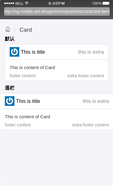
默认
Card 默认样式
import { Component } from '@angular/core';@Component({selector: 'demo-card-basic',template: `<WingBlank [size]="'lg'"><Card><CardHeader [title]="'This is title'"[thumb]="'https://gw.alipayobjects.com/zos/rmsportal/MRhHctKOineMbKAZslML.jpg'"[thumbStyle]="thumbStyle"[extra]="extra"><ng-template #extra><span>this is extra</span></ng-template></CardHeader><CardBody><div>This is content of Card</div></CardBody><CardFooter [content]="'footer content'" [extra]="footerExtra"><ng-template #footerExtra><div>extra footer content</div></ng-template></CardFooter></Card></WingBlank>`})export class DemoCardBasicComponent {thumbStyle = {width: '32px',height: '32px'};}
通栏
Card 通栏样式
import { Component } from '@angular/core';@Component({selector: 'demo-card-full',template: `<Card [full]="true"><CardHeader [title]="'This is title'"[thumb]="'https://gw.alipayobjects.com/zos/rmsportal/MRhHctKOineMbKAZslML.jpg'"[thumbStyle]="thumbStyle"[extra]="extra"><ng-template #extra><span>this is extra</span></ng-template></CardHeader><CardBody><div>This is content of Card</div></CardBody><CardFooter [content]="'footer content'" [extra]="footerExtra"><ng-template #footerExtra><div>extra footer content</div></ng-template></CardFooter></Card>`})export class DemoCardFullComponent {thumbStyle = {width: '32px',height: '32px'};}
API
Card
| 属性 | 说明 | 类型 | 默认值 |
|---|---|---|---|
| full | 是否通栏 | boolean | false |
CardHeader
| 属性 | 说明 | 类型 | 默认值 |
|---|---|---|---|
| title | 卡片标题 | TemplateRef、String | |
| thumb | 卡片标题图片 | String、TemplateRef | |
| thumbStyle | 标题图片样式 | Object | {} |
| extra | 卡片标题辅助内容 | TemplateRef、String |
CardBody
| 属性 | 说明 | 类型 | 默认值 |
|---|
CardFooter
| 属性 | 说明 | 类型 | 默认值 |
|---|---|---|---|
| content | 尾部内容 | TemplateRef、String | |
| extra | 尾部辅助内容 | TemplateRef、String |
